Anytime I see this rear its head I remember looking at charts. The high cost of healthcare looks directly attributed to government involvement. (And I agree that gluttonous bureaucracy is the first thing that needs some stapling... )
Most people connect the HMO act of 1973 with the skyrocketing of costs. We see that in this 100 year chart:
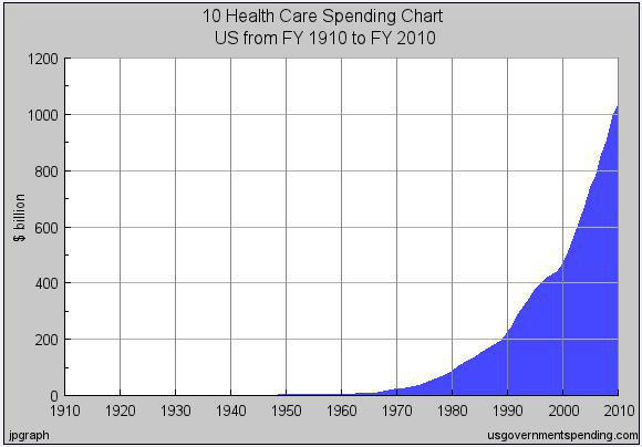
But the visual story goes back further, with precipitous rises from earlier government interventions
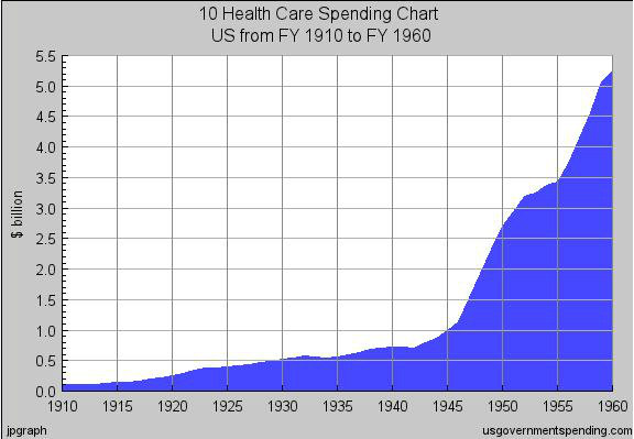
Roosevelt's irksome Revenue Act of 1942 opened Pandora's Box and incubated the quasi public monstrosity we see today. It gave tax incentives to businesses for Healthcare "benefits", it did not include any such incentives to individuals... So lets look at a smaller section of that chart from that era - 1910 to 1960

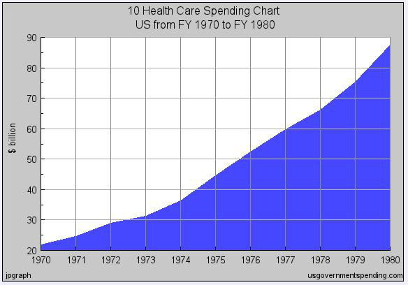
The next foray by the socialists was the Medicare Act of 1965, so lets look at that time frame:

What is kinda disturbing is how moderate the pre Medicare rise looks compared to the former chart, which ends where the latter begins...
Which brings us to the HMO Act of 1973, which actually doesn't show such a drastic rise (and my layman's mind attributes to the onerous nature of these cumulative interventions with the corresponding avalanche of paperwork bureaucracy pushes to justify its existence)
which brings us back to the first chart, only lets bring it as far back as we can go - 1792 to 2010
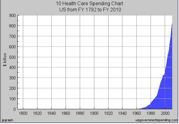
Looks to me like government meddling is the problem
It should also be noted that during the entire history of the US, we have been close to the top among countries for life expectancy. Further, it was mainly the Nordic countries that we trailed as the avg has risen worldwide and it has basically been since the time frames mentioned in the above charts that the rest of the world has been catching up and overtaking. A tool to see that is here:
www.bit.ly/coSUs8
Charity is good - Mandates are bad.


")

Connect With Us