Page 2 of 3 FirstFirst 123 LastLast
Results 31 to 60 of 73

Thread: Tea Party Logo Submissions Here

  1. #31
    Stuff that has been posted:


    from theprolific:


    Old style modification from foofighter20x:


    from truthspeaker:


    from Bacon:


    From mfoley1:
    Last edited by nathanielyao; 11-10-2007 at 11:42 AM.
    2008 Ron Paul Delegate - Congressional District 5
    Working on 2012
    -----
    Liberty is lost through complacency...America was born of protest [and] revolution... - RP, 8/9/04
    -----
    The true patriot is motivated by a sense of responsibility, and out of self interest -- for himself, his family, and the future of his country... - RP, 5/22/07
    -----
    But let it not be said that we did nothing. - RP, 5/22/07


  2. Remove this section of ads by registering.
  3. #32
    heres another one, glows

    Be the change you want to see in the world. Mahatma Gandhi


  4. Remove this section of ads by registering.
  5. #33
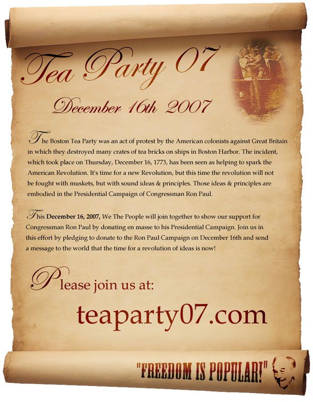
    Bacon's is still my favorite so far, easily. It's very clean and professional looking. I wish it would get remade into a banner and/or header image.
    tu ne cede malis

  6. #34
    this is the one i made to put on my myspace. feel free to use it or change it for whatever


  7. #35
    Quote Originally Posted by mfoley1 View Post
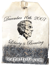
    This one is my favorite by far. I like the other ones that are brown without tea bags too though a lot. I hope we use these for promoting a lot they look so good.

  8. #36
    Quote Originally Posted by Krippy View Post
    Bacon's is still my favorite so far, easily. It's very clean and professional looking. I wish it would get remade into a banner and/or header image.
    Bacons is good, he should consider making some banners too.
    Be the change you want to see in the world. Mahatma Gandhi

  9. #37
    Quote Originally Posted by rainman39393 View Post
    this is the one i made to put on my myspace. feel free to use it or change it for whatever

    Can you please stop saying taxation without representation? We have representation, but idiot america keeps voting in people to represent us that only represent the quickest way for them to get money.

    Voters are going to think that slogan is stupid when they see it because they're going to think "I've got representation...."

  10. #38
    Quote Originally Posted by justinc.1089 View Post
    This one is my favorite by far. I like the other ones that are brown without tea bags too though a lot. I hope we use these for promoting a lot they look so good.
    I need to actually fix that so it will look better on colored backgrounds, i'll get an alt up for the teabag one soon.
    Be the change you want to see in the world. Mahatma Gandhi

  11. #39
    Quote Originally Posted by nathanielyao View Post
    Stuff that has been posted:


    from theprolific:


    Old style modification from foofighter20x:


    from truthspeaker:


    from Bacon:


    From mfoley1:
    I like the one that has the crates being tossed that say things like inflation and the Iraq war.

    How do we get the codes for these to use them?

  12. #40
    Quote Originally Posted by justinc.1089 View Post
    Can you please stop saying taxation without representation? We have representation, but idiot america keeps voting in people to represent us that only represent the quickest way for them to get money.

    Voters are going to think that slogan is stupid when they see it because they're going to think "I've got representation...."
    Better? I changed some other things too.


  13. Remove this section of ads by registering.
  14. #41
    Yeah it looks great now! Its another one of my favorites on here. Personally since I also feel like we're basically without representation I can relate to that slogan, but I don't think hardly any voters will since a lot of people on here don't even care for it much really. I mean it was ok in popular opinion but not great or anything. I like how you did the coloring on this the best probably.

  15. #42
    Quote Originally Posted by mfoley1 View Post
    heres another one, glows

    radical!

    Quick question/observation... where did you all score that line-drawn Ron Paul head shot??

    Its reminds me of/almost looks like Lincoln.. in other words.. EPIC

  16. #43
    Quote Originally Posted by mfoley1 View Post
    glad to see someone started a thread for this! I should have 1 or 2 more and an animated one coming soon...


    I like these best...
    "None are more hopelessly enslaved than those who falsely believe that they are free." -Göthe
    "All that is required for evil to prevail is for good men to do nothing." - Edmund Burke
    "Government is a disease masquerading as its own cure." - Robert LeFevre

  17. #44
    There's some great work here! Good job to everyone who designed these

  18. #45
    Quote Originally Posted by wfd40 View Post
    radical!

    Quick question/observation... where did you all score that line-drawn Ron Paul head shot??

    Its reminds me of/almost looks like Lincoln.. in other words.. EPIC
    ronpaul2008.com, its on there, left side
    Be the change you want to see in the world. Mahatma Gandhi

  19. #46

    Updated Logo designs

    I've made a few changes to the first one I posted.

    Option 1


    Option 2
    Last edited by LBT; 11-11-2007 at 06:03 AM. Reason: Several Adjustments

  20. #47
    Aren't there better pictures of Paul where his neck isn't sicking out like he has a goiter?

    .
    Last edited by Man from La Mancha; 11-11-2007 at 01:42 AM.

  21. #48
    looking at the post above, it just occurred to me that the next "20 dollar bill" could be a gold coin with Ron Paul's face on it @_@ sorry for being slow on the uptake, but I'm with the crowd calling it "epic"


  22. Remove this section of ads by registering.
  23. #49

  24. #50
    Quote Originally Posted by Flirple View Post
    What I love about it is that it has all the essential info. I think it would be better if the text was a lot easier to read and perhaps a relevant picture graphic behind the text in the middle. Right now it looks a bit too generic.
    I agree, with you. That image would make a good sticker or pin.

  25. #51
    Quote Originally Posted by LBT View Post
    I've made a few changes to the first one I posted.

    Option 1


    Option 2
    These are great. The comment above could be applied to these too.

  26. #52

    Ron Paul profile

    Quote Originally Posted by Man from La Mancha View Post
    Aren't there better pictures of Paul where his neck isn't sicking out like he has a goiter?
    How about the one from the mosaic newspaper ad from Iowa?
    Rand Paul is in the top 1% of US Senators.

  27. #53
    These could benefit greatly from having 'Ron Paul' and/or 'RonPaul2008.com' on them.

    We know what Ron Paul looks like, and so we know what the banners mean, but many people don't know what he looks like and they won't be bothered to look into something if they don't know what it is.

  28. #54
    Quote Originally Posted by mfoley1 View Post
    Wow! There are so many great options on this thread. Great work everyone. It's hard to choose, but if I had to I think this would be my favorite.

  29. #55
    Guys,
    Thanks for all the contributions!

    I think some are good for large scale pics and others good for various banner widths and spaces.

    It's good to offer various choices to people who want to use graphics to promote this way in one way or another.

  30. #56
    In this one, RP's shoulders look too narrow. Makes him look like one of those bobbing head dolls. Would you be able to widen the shoulder area?

    Quote Originally Posted by LBT View Post
    Option 2


  31. Remove this section of ads by registering.
  32. #57
    Quote Originally Posted by mfoley1 View Post
    This is up with linking code! Great one

  33. #58
    Some Avatars I threw together:


  34. #59
    this line drawing seems to be from my friends design shown here": ronpaultshirts.com

    guess it got popular

  35. #60
    Quote Originally Posted by mfoley1 View Post
    ronpaul2008.com, its on there, left side
    Actually I did the illustration from a photo by Richard DeYoung who gave me permission to make derivatives.

    After having used it on many things someone noted the neck thing. Now that I'm not happy with the neck problem it seems to be beyond my scope to change it everywhere on the products and the net.

    Oh well.

    Good work Mark! I really like the tea bag designs the best!

Page 2 of 3 FirstFirst 123 LastLast


Similar Threads

  1. NEW LOGO NOW! Ron Paul 2012 logo!
    By Pseudolus in forum Marketing Strategy, Influence & Persuasion
    Replies: 57
    Last Post: 05-24-2011, 12:48 PM
  2. Replies: 0
    Last Post: 04-28-2011, 03:50 PM
  3. Replies: 15
    Last Post: 08-09-2009, 05:10 AM
  4. Looking for submissions at dontspreadmywealth.com
    By Herbo in forum U.S. Political News
    Replies: 0
    Last Post: 07-31-2009, 05:18 AM

Posting Permissions

  • You may not post new threads
  • You may not post replies
  • You may not post attachments
  • You may not edit your posts
  •